Saudia Airlines · 2022–2023
SaudiaBEYOND
A cultural rebrand and website redesign that gives Saudia a modern, proud identity rooted in its heritage.
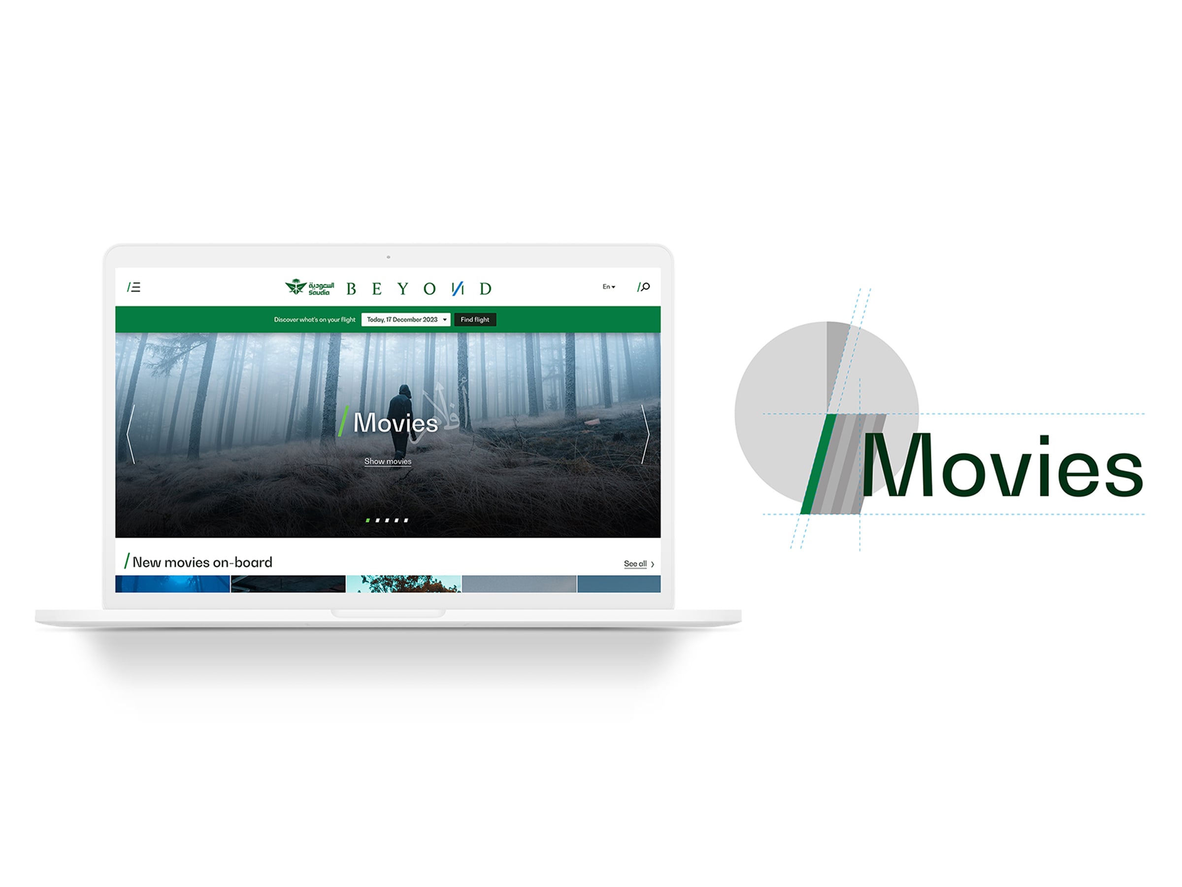
- Role
- Brand & UX/UI Designer
- Project type
- Brand identity, website UX/UI, accessibility
- Year
- 2022–2023
- Team
- Julian Harris · UX DirectorCatherine Grey · Creative DirectorEduarda Zacaro · Brand & UX/UI DesignerBryan Giraldo (Me) · Brand & UX/UI DesignerArif Saeed · PM
Overview
SaudiaBEYOND was created as the new brand system for Saudia Airlines' entertainment platform and passenger touchpoints. The brand combines Saudi Arabia's forward-looking vision with its cultural heritage, reflecting the nation's shift toward new industries. My work focused on the brand's digital expression, especially the website, which was rebuilt for mobile and desktop to follow the new corporate identity. The project also set the foundation for the in-flight entertainment and ordering experiences that followed.
The Challenge
Saudia’s existing image felt generic and outdated, and it did not reflect the direction the company wanted to take. The airline needed a brand that could be recognized as its own source of pride, represent its roots and origins, and work consistently across products and technology. The goal was to attract a more international audience and bring the Saudia identity to passengers everywhere.
The challenge was also cultural. Most of the team did not share Saudi Arabia’s language, heritage, or religion, so the design had to be grounded in research before it could be built. Every visual and interaction decision had to respect the culture it represented while still feeling modern and accessible.
Responsibilities
- Designed brand and UX/UI for the Saudia website across mobile and desktop, from research through delivery.
- Helped rebuild the website so it followed the new corporate identity and its requirements.
- Contributed to brand identity decisions, including color, typography, and visual direction.
- Helped shape the design system for the website and app, so components and patterns stayed consistent across both.
- Designed information architecture and user flows so passengers could find and complete tasks in fewer steps.
- Contributed to the UX foundations that later connected the website with the in-flight entertainment system.
- Applied accessibility, contrast, and legibility standards based on global guidelines.
Research & Process
Because the team needed to understand the culture before designing for it, the project began with research rather than visual exploration. The first phase included a trip to Saudi Arabia to study the country’s culture, heritage, and origins, and to understand how Saudia could reflect them with respect and authenticity.
Next, I analyzed the existing website and its data to understand how users navigated it, where they dropped off, and which tasks were hardest to complete. I also benchmarked airline and hospitality brands across regions to identify patterns that worked well and gaps the new identity could fill.
Color selection was one of the most important parts of the research. Colors were not chosen only for aesthetics. Each one was studied for its cultural meaning, since the same color can signal luck, wealth, sadness, or misfortune depending on where it is seen. Every choice was made to reinforce the message the brand needed to communicate in each market.
Finally, every milestone was reviewed with Saudia, who served as the final decision maker. Accessibility was tested throughout the process with contrast audits and guideline checks to make sure the interface was legible on every device and for every user.
Scope & Primary Journey
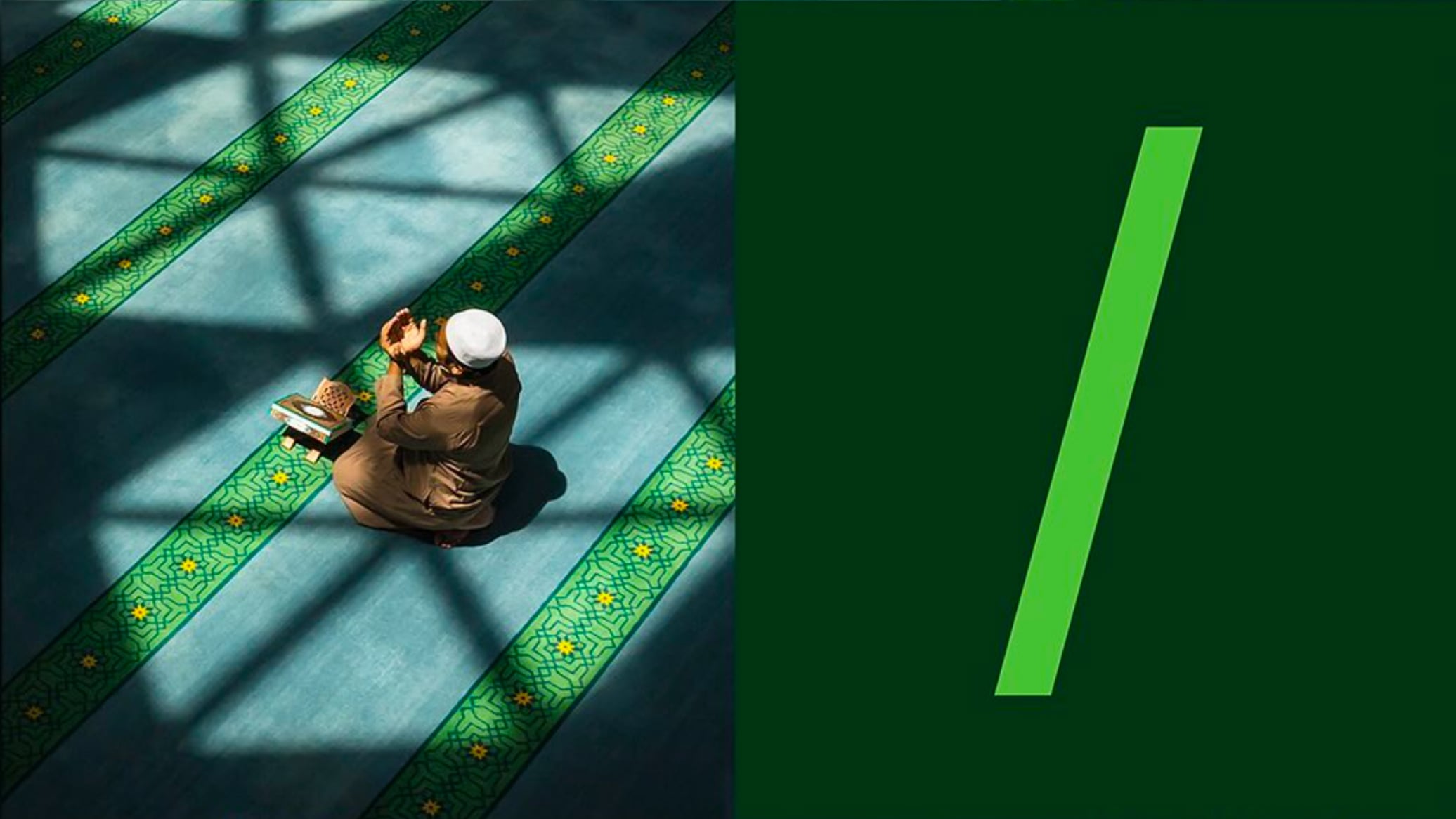
Brand Foundations & Cultural Research
Before designing screens, the brand needed a clear purpose. This section defined the identity’s direction: a blend of Saudi heritage and future vision that could represent the nation to a global audience.
Website UX/UI for Mobile & Desktop
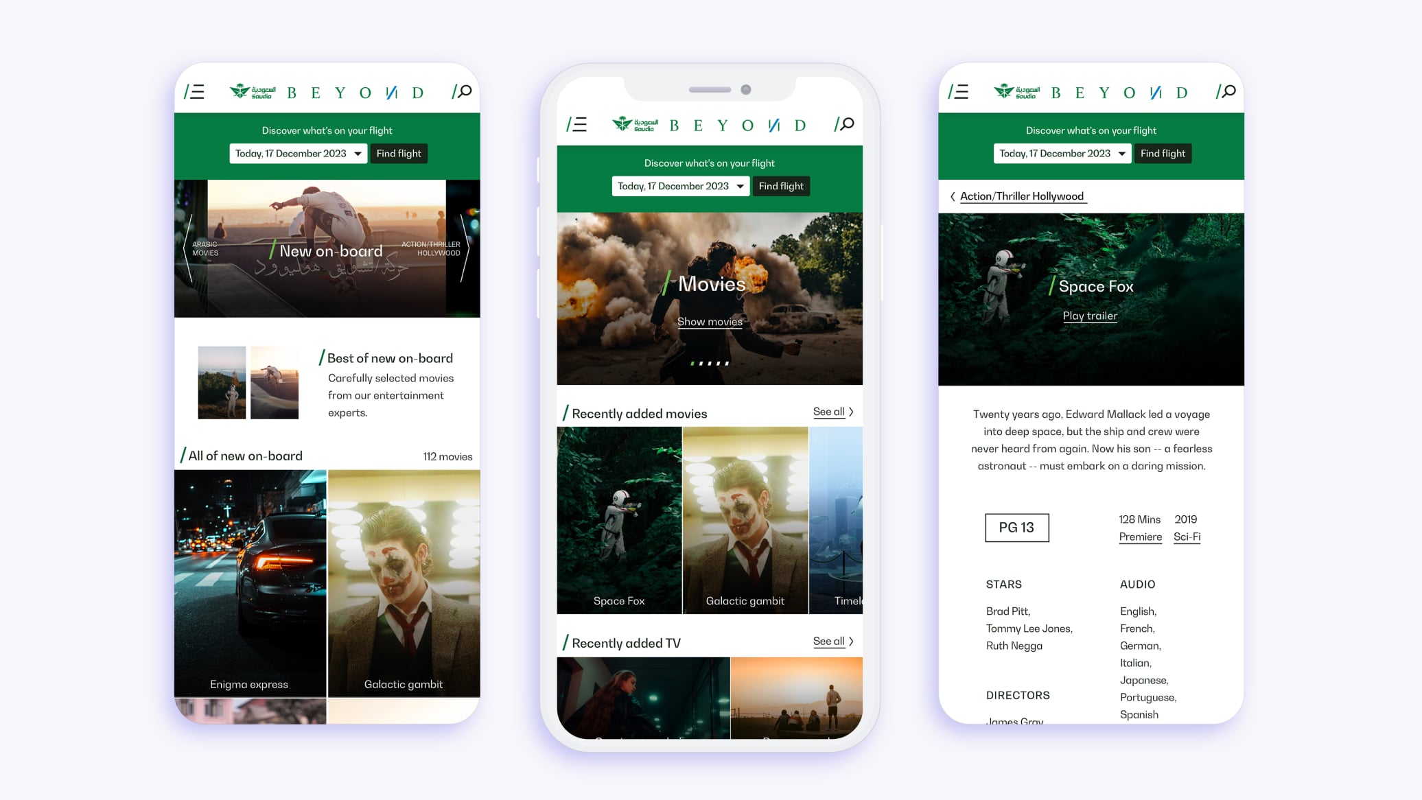
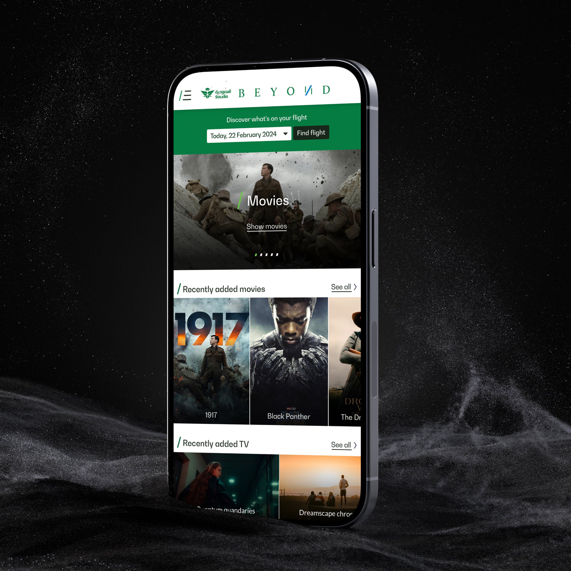
The website was restructured to make navigation clearer on both devices, with hierarchy, content, and page flows designed around the most common tasks passengers and visitors need to complete.
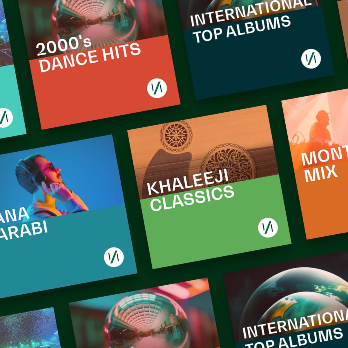
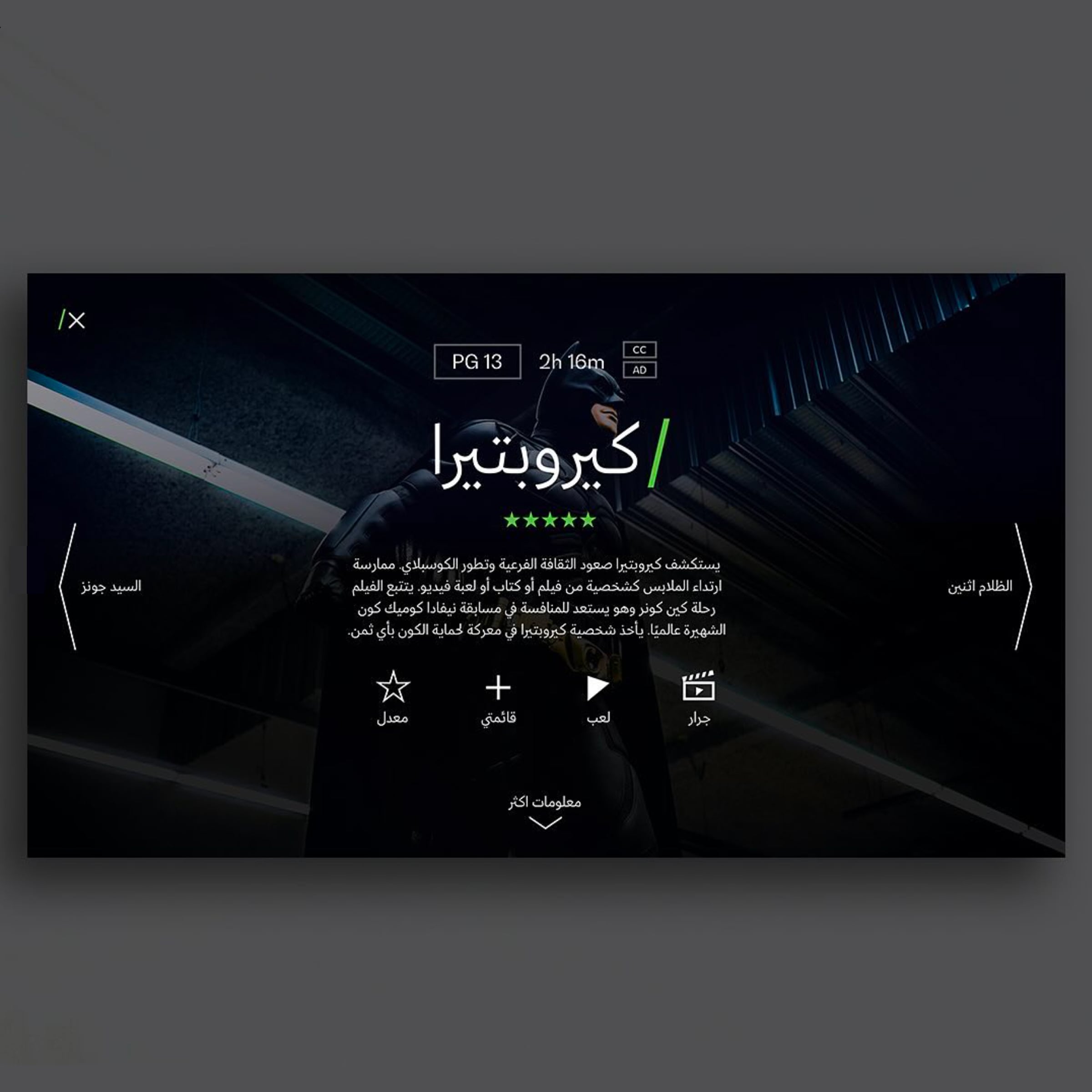
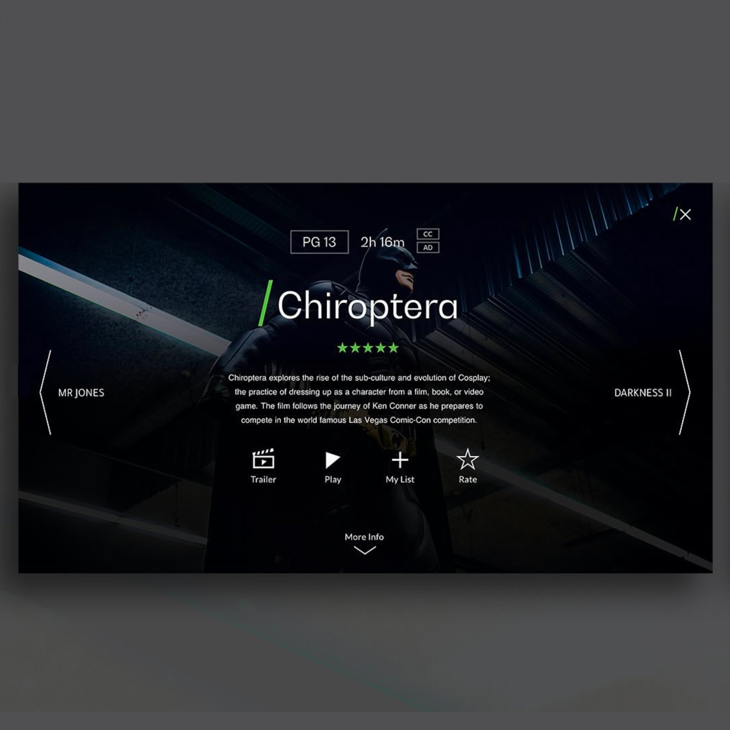
Color, Typography & Arabic Expression
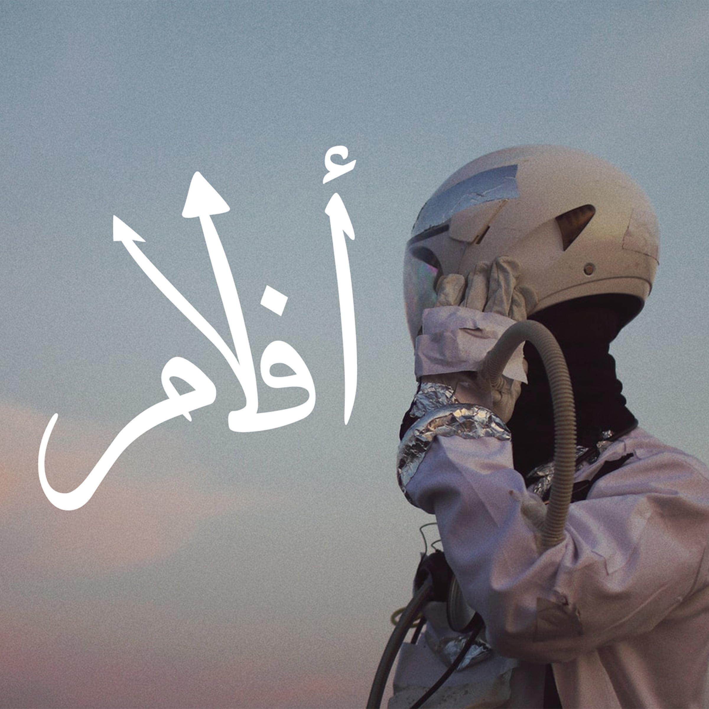
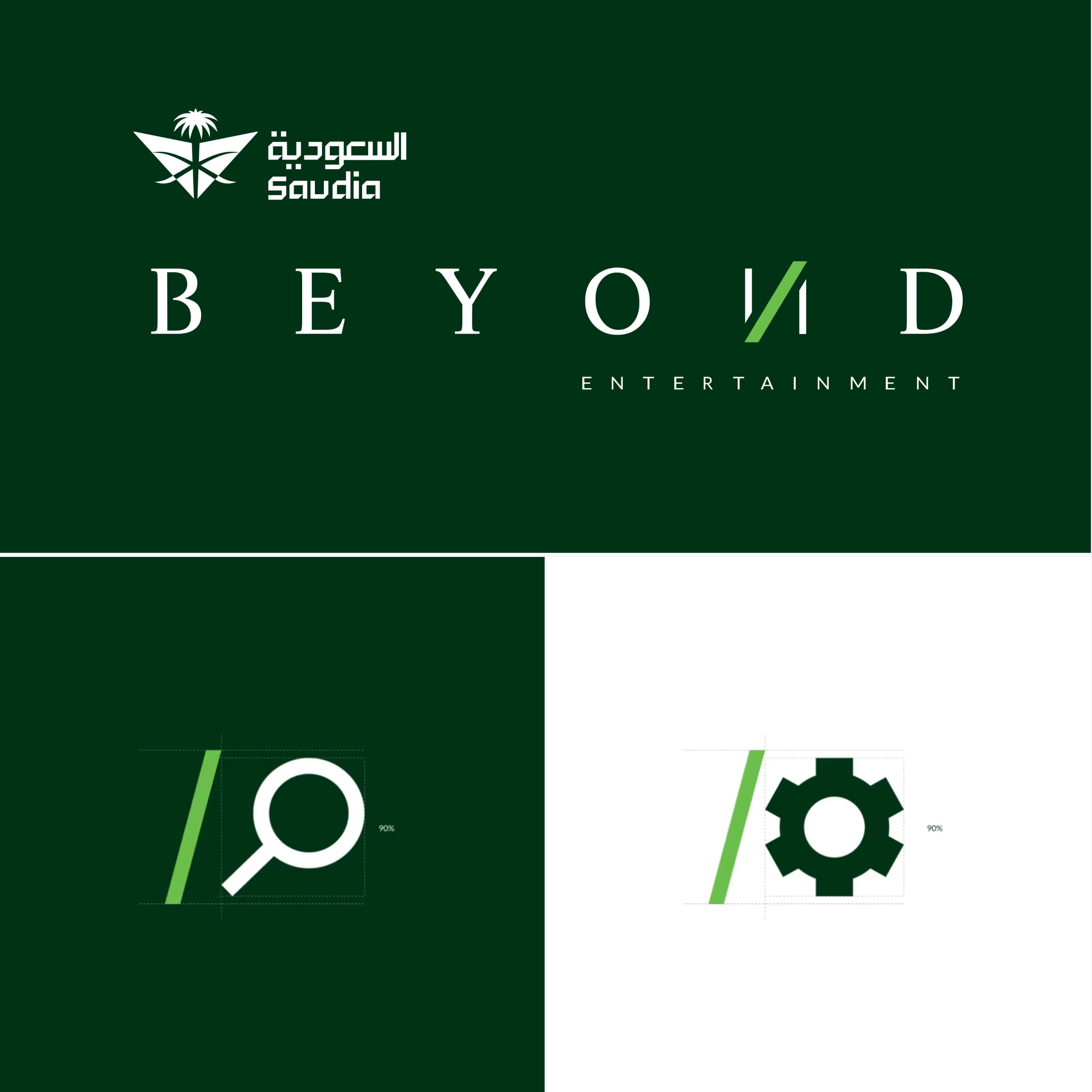
Color and typography were selected to balance readability with cultural expression. The modern sans serif supports clarity, while the Arabic typography brings the country’s calligraphic tradition into the interface.
Connecting the Website to the Cabin
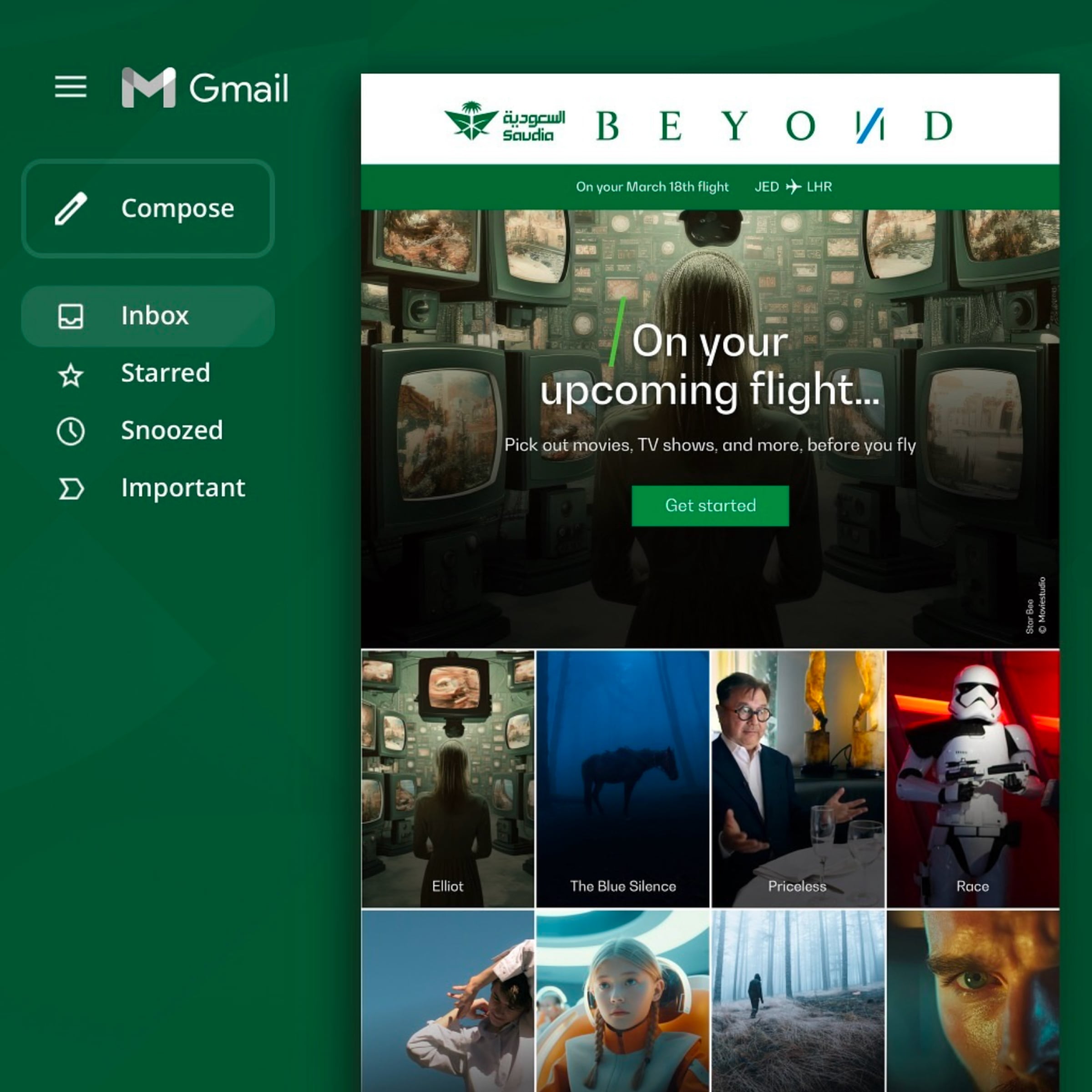
The website was designed as the first step of the passenger journey. Actions such as choosing meals or entertainment could be planned online, so the seat-back screen already reflects the passenger’s preferences when they board.
Accessibility & Contrast
Every screen was tested against international accessibility standards for contrast, type size, and touch targets, so the experience works for a wide range of users.

User Testing
The primary reviewer and validator was the client, Saudia, who approved each stage of the project. Alongside client reviews, the design went through detailed contrast and accessibility testing, following global standards to ensure legibility, usability, and inclusive use across devices.
Outcomes & lessons learned
- 62%Increase in browser retentionOn the website compared to the previous version
- 24%Increase in completed tasksUsers completing tasks on the website
Lessons
- Understanding the brand’s name, purpose, and cultural context is the first step of any design. Without it, visual decisions are only decoration.
- Colors carry meaning that changes between regions. A palette has to be studied for how it will be interpreted, not only for how it looks.
- When the team does not share the audience’s culture, research is what closes the gap. Immersion, data, and benchmarking matter more than assumptions.
Summary
SaudiaBEYOND gave Saudia a brand that is modern and proud of its roots. The website became clearer and easier to use, and the foundation it created carried into the in-flight experience that followed.